Final Project: Interactive Infographic “Spatiotemporal Social Media” Assignment #8b

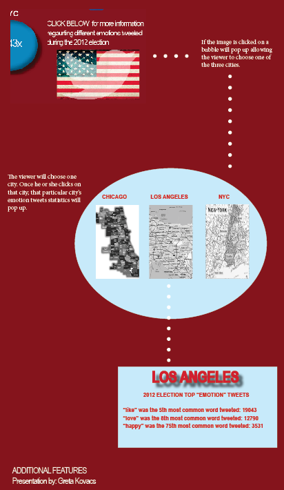
Emotions Tweeted During 2012 Election

This infographic focuses on telling a story about how and what people were tweeting during the 2012 elections. The illustration focuses on the emotion characters tweeted (within the top 100 tweets) that were tweeted in three cities: NYC, Los Angeles, and Chicago.

Below is the sketch:

photo

Below is the infographic:

Screen Shot 2012-12-07 at 7.31.19 AM

Screen Shot 2012-12-05 at 1.42.39 PM

Assignment #8b Part 1 & 2

Country Music Concerts: Los Angeles 2012

This information map illustrates the top 10 country music concerts that took place in Los Angeles in 2012. Through the “Mapping Patters of Information” and by using Manual Lima’s “Centralized Ring” syntax pattern of info map as a guide, the interactive image explores the ways 10 top country bands/artists connect: they all performed in Los Angeles in 2012.

Below you will find sketches done before the final product:

Below is the final product:

Assignment #7 MIDTERM: Social Media & the Fashion Industry 2012

“Social Media & the Fashion Industry 2012” is a multi-layered infographic that portrays how social media has affected the fashion industry in 2012. Through research and data gathering, it is evident that fashion brands and retailers face a continuous challenge of maintaining a balance in today’s social media world. It is essential that fashion retailers find a way to sustain exclusivity while also maintaining and enhancing communication. Social media allows fashion brands/retailers/designers to reach a wider audience and communicate with followers who can amplify the brands image and message through his/her individual social media outlet. The infographic portrays the top fashion brands and retailers in 2012, and shows how they are using social media today. Similarly, the infographic explains how social media has changed the fashion world. Many luxury brands have turned to and rely on fake twitter followers to appear more “liked/followed.”

Below is the Infographic sketch:

MIDTERM SKETCH

Below is the final Infographic:

MIDTERM FINAL – JOUR 499

Assignment #6: Analyze/Dissect Color Usage in Inforgraphics

Analyze/Dissect Color Usage in Inforgraphics:

The infographic image used for this assignment was found on columnfivemedia.com. I selected the “Halloween By Numbers” infographic and mapped it out using the six key points noted. The purpose of this assignment was to create a visual journey in which I analyzed the various colors and components of the infograghic.

Below is the sketch of my design:

Below is the final design:

Assignment #5 – Starbucks Signage Chart

This week’s assignment was to select a signage theme, photograph its key components and create a signage chart. I selected Starbucks Inc. and photographed various signs within a particular Starbucks location and then created the Starbucks Signage Chart below. The signage chart portrays the consistency of Starbucks’ continuity and branding. The photographs in the chart are each paired with a short caption that justifies the photograph as well as explains the key points.

Below is the sketch for the signage chart:

Below is the final Starbucks Signage Chart:


Week #4, Assignment #3: Starbucks Coffee Timeline

Starbucks Coffee Chronological Timeline

The Starbucks Coffee Chronological Timeline below illustrates the key points in the development of Starbucks Coffee Inc. and its brand evolution. The timeline begins in 1971 when Starbucks opened its first store in Seattle’s Pike Place Market. It chronologically portrays various important dates in the brands history and changes in the brand’s graphic identity.

(Sketch is below)

Below is the original Starbucks Coffee Timeline which can also be located on the web here.

Week #3, Assignment #2b: WEB-site Analysis Based on Principles of Design

LF WEB-site Analysis Based on Principles of Design

The horizontal visual diagram below analyzes LF’s website (http://www.lfstores.com/). This website adheres to the 10 principles of design.

Additionally, the visual diagram below analyzes two websites (http://www.shapes.com.ph/ AND http://bamboobettie.wix.com/clothing) and compares them to the LFstores website. Both websites are missing at least two points of the basic principles of design.

Sketch: